Every state · 37 captures · 7 stores
Product Listing (PLP) patterns
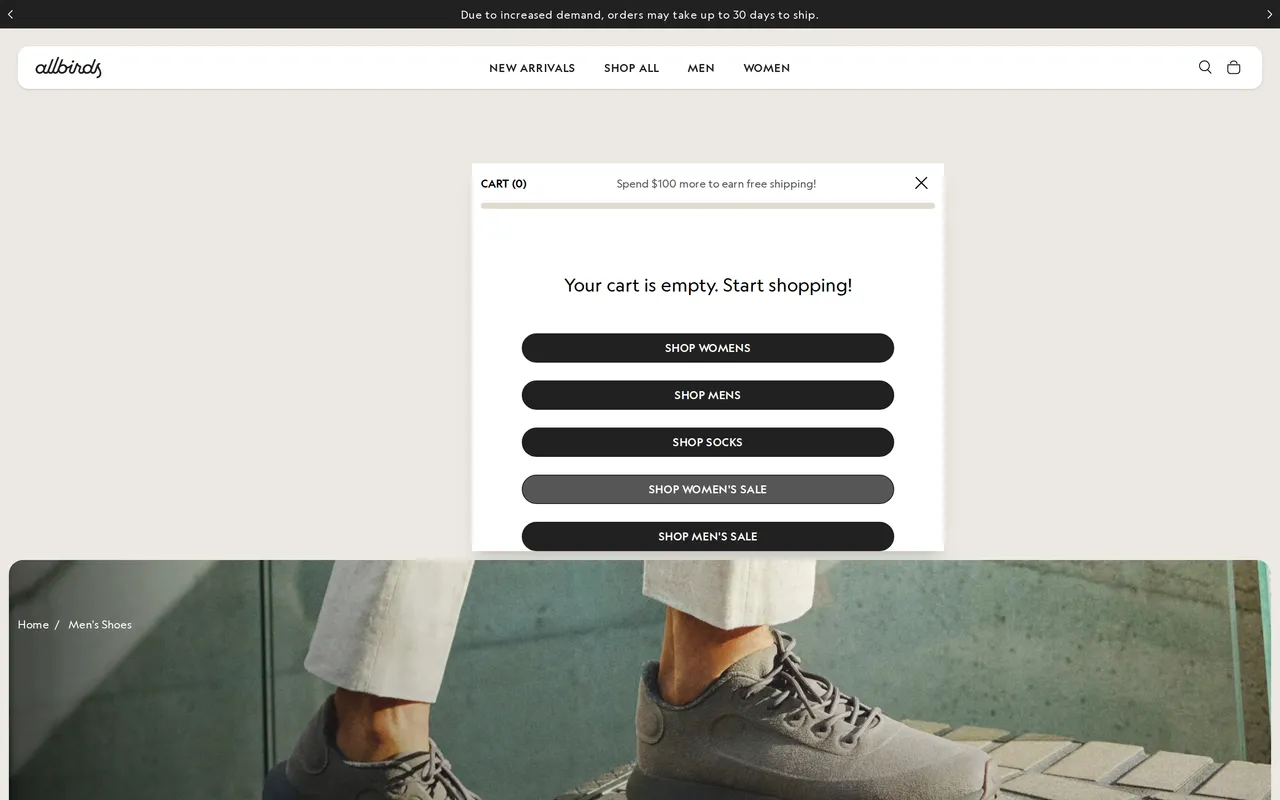
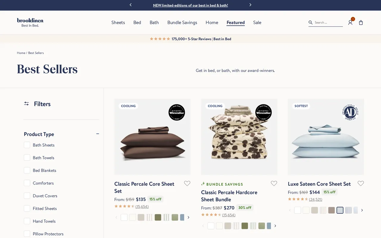
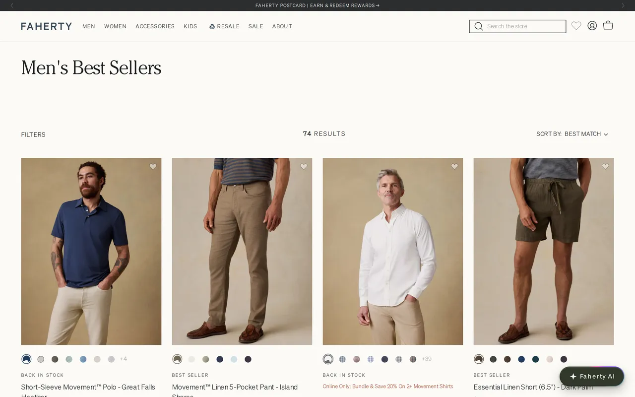
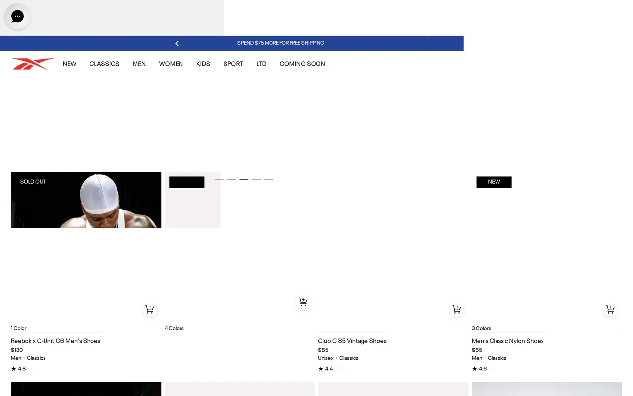
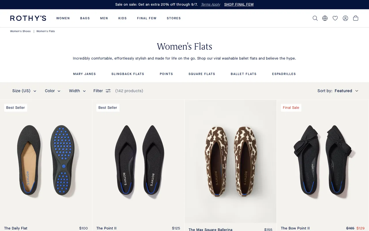
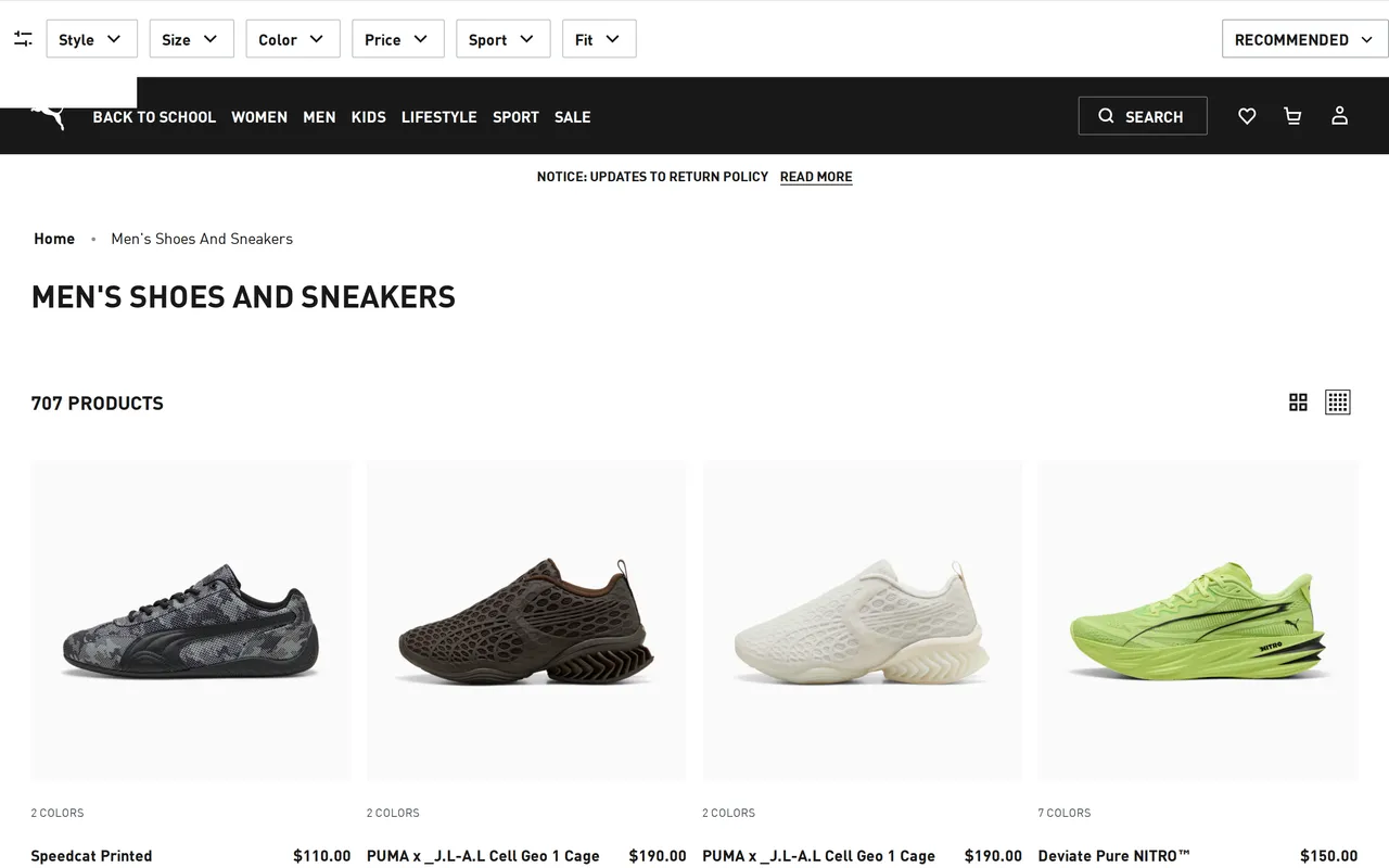
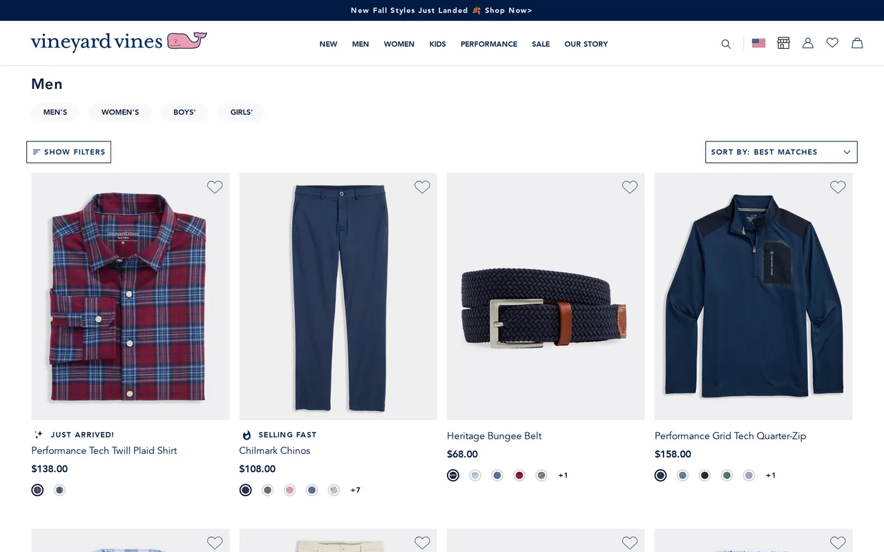
Product listing and collection grids: how stores lay out products, filters, and sorting for browsing shoppers. Every example below is a real capture from a live storefront, not a mockup.







About the product listing (plp) pattern
What it is
The product listing page is the grid a shopper lands on after clicking a category, a collection tile, or a nav link, the layer between "I want shoes" and "I want this pair of shoes." It has to compress an entire assortment, sometimes hundreds of SKUs, into a scannable grid with enough information per tile (price, swatches, a second image on hover) that a shopper can shortlist candidates without opening each one.
Why it matters for conversion
This is where most of the catalog's traffic gets filtered down to the handful of products that actually get a product-page visit, so friction here has an outsized multiplier effect: a confusing filter panel or a slow-loading grid doesn't just cost this page a conversion, it costs every PDP downstream a chance to be seen at all. Sort and filter quality also directly affects average order value, since shoppers who can narrow by the attribute they actually care about (size, price band, color) are far more likely to find something worth buying than ones stuck scrolling an unsorted wall of tiles.
What to look for
A well-built PLP puts the filters shoppers actually use, size, price, color, within one click, keeps the applied-filter state visible so it's obvious what's been narrowed, and loads new results without a full page reload. Tile density matters too: enough information (price, a color-swatch preview, a badge for low stock or new arrivals) to shortlist without clicking through, but not so much that the grid feels cluttered. Sticky filter bars and a visible result count are small details that separate a fast-feeling PLP from a slow one.
Common variations
Fashion retailers typically foreground color swatches directly on the tile so a shopper can preview variants without a click, while grocery and CPG sites lean on quick-add buttons right in the grid because repeat purchases dominate their traffic. Marketplaces with huge catalogs invest heavily in faceted filtering (brand, rating, seller) since their grids can run into the thousands of results, whereas single-brand DTC sites with a tighter assortment often skip filters almost entirely in favor of simple sort controls.
Brand palettes in this gallery
The exact colors these product listing (plp) screens are built from, sampled from each live storefront.
Related terms
See every product listing (plp) flow, state by state
The whole library is free to browse. Pro pipes these patterns straight into your AI tools over MCP.
Free to browse · Pro unlocks the MCP