Every state · 90 captures · 16 stores
Homepage patterns
The storefront's front door: how real brands open with promos, hero imagery, and navigation into the catalog. Every example below is a real capture from a live storefront, not a mockup.
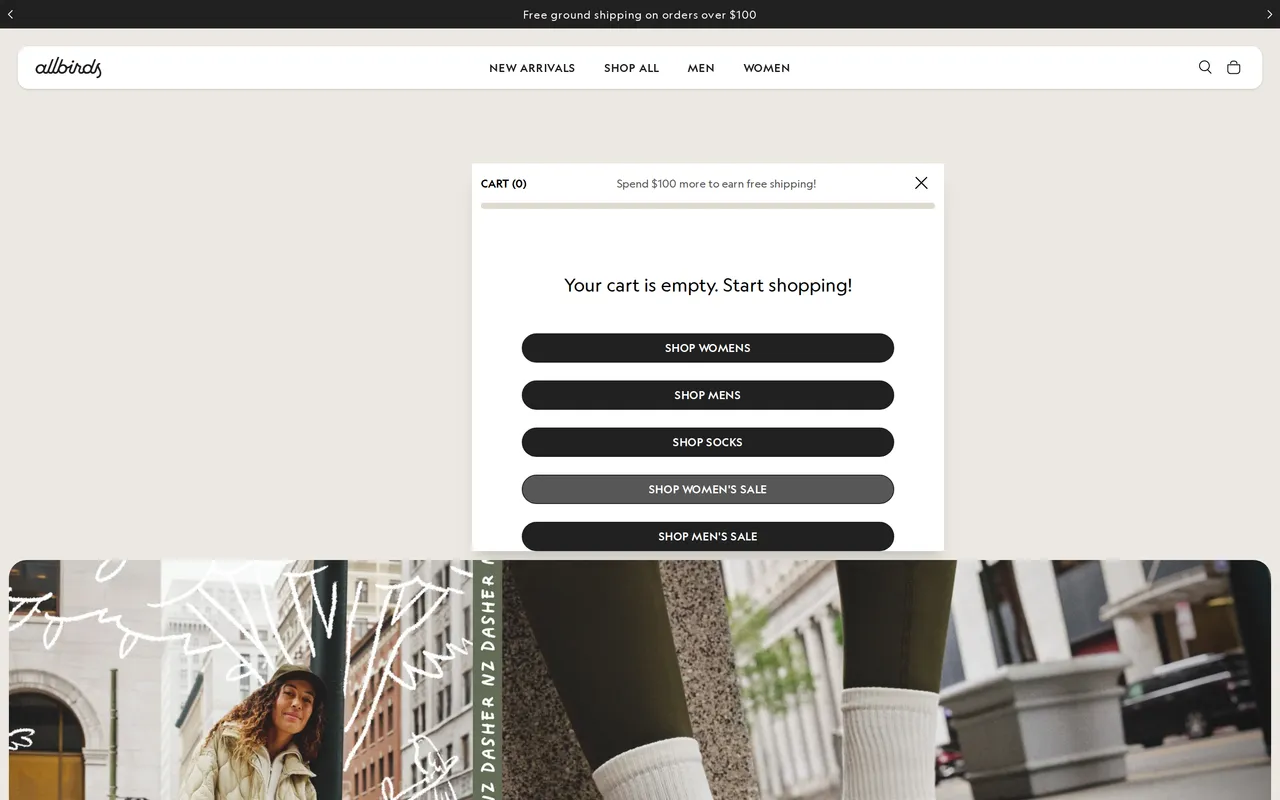
 allbirds.comHomepage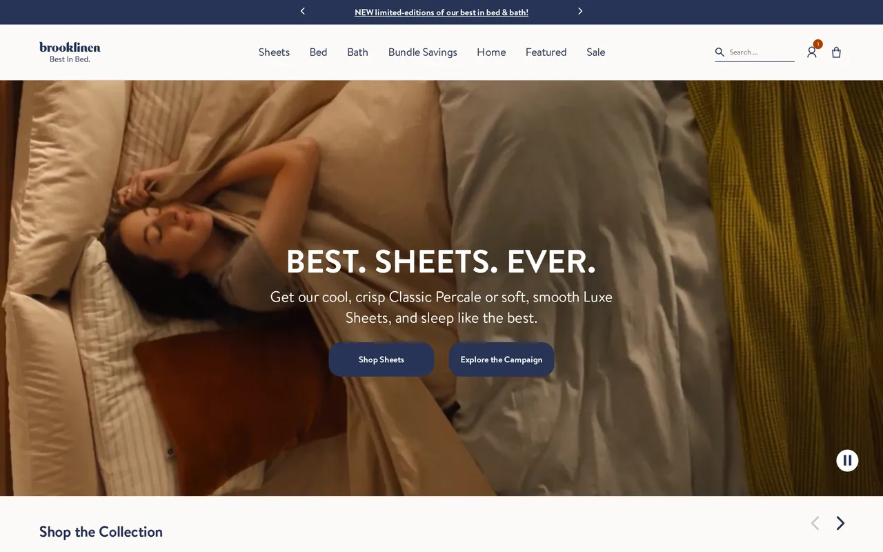
 brooklinen.comHomepage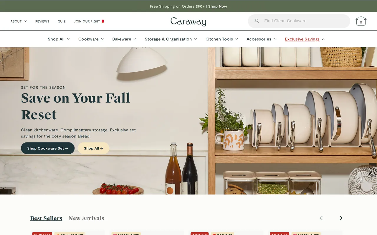
 carawayhome.comHomepage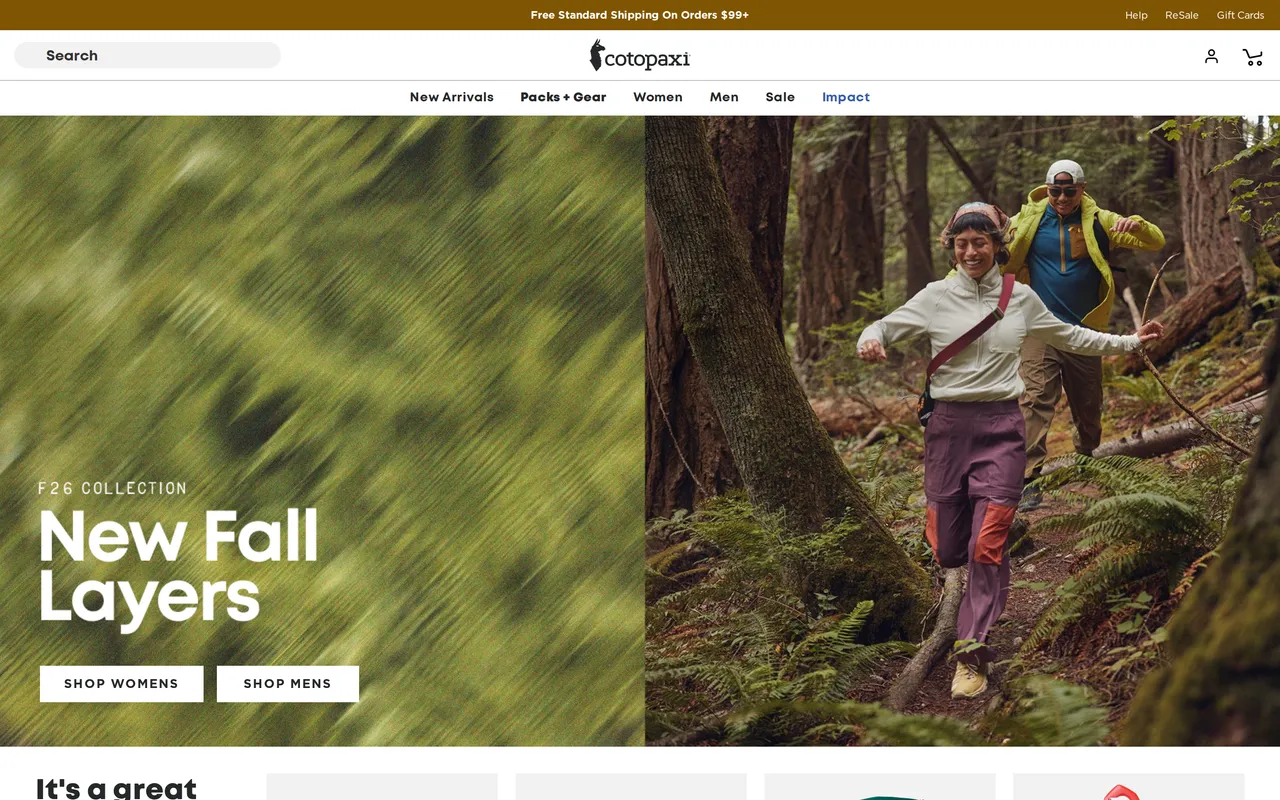
 cotopaxi.comHomepage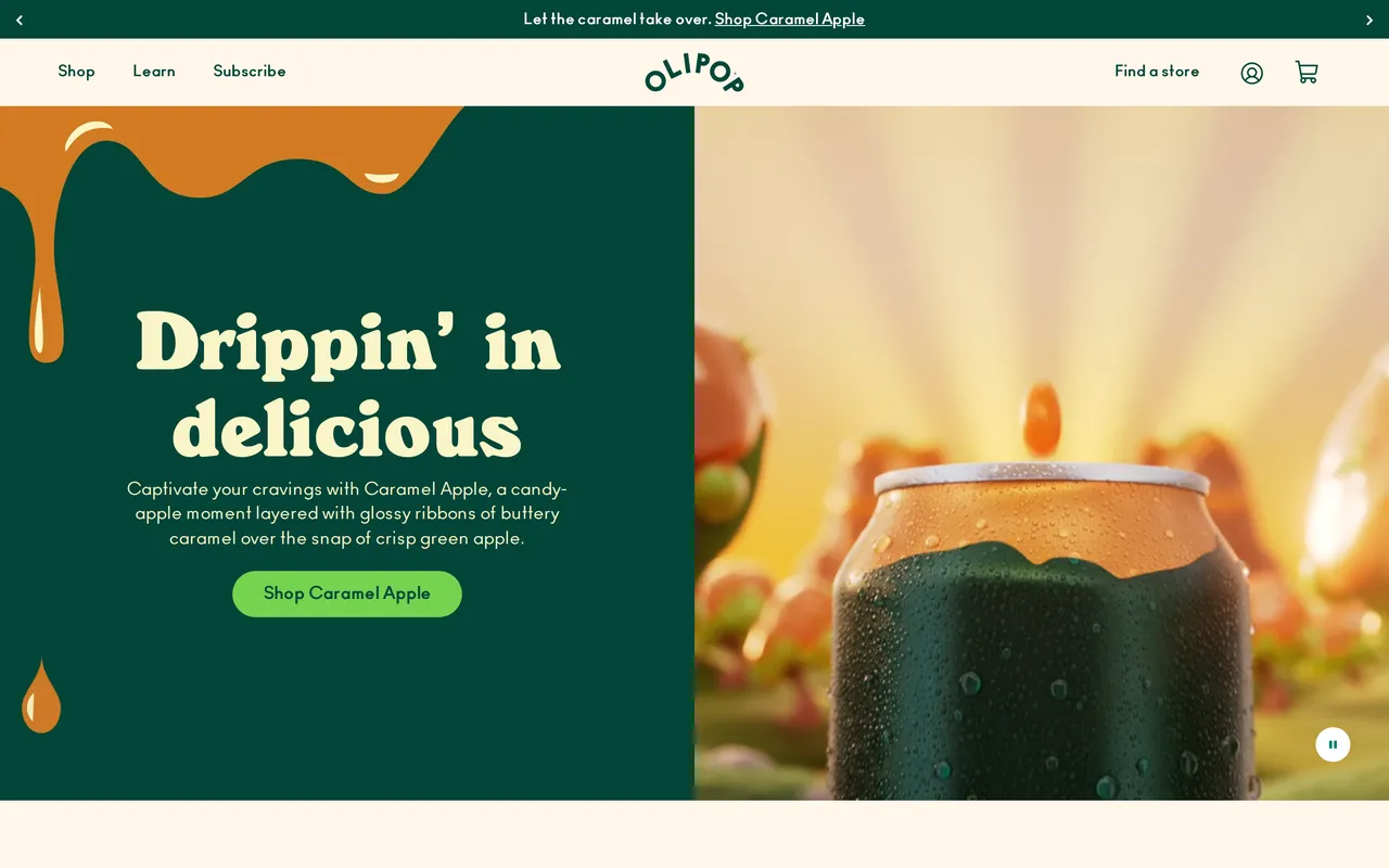
 drinkolipop.comHomepage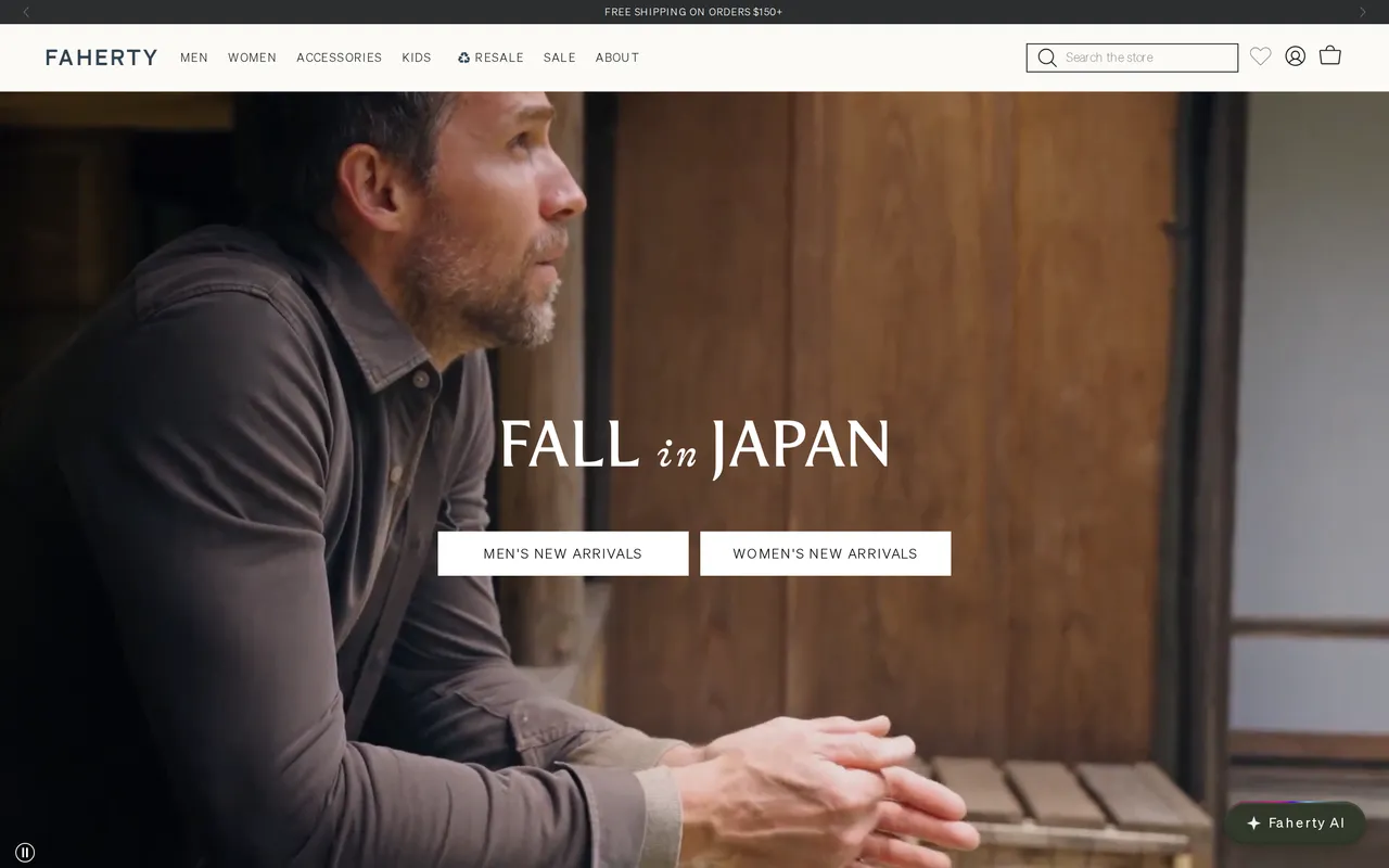
 fahertybrand.comHomepage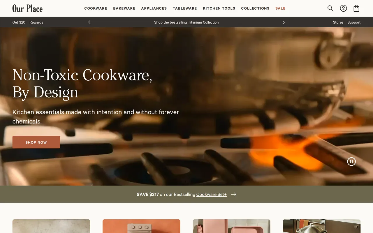
 fromourplace.comHomepage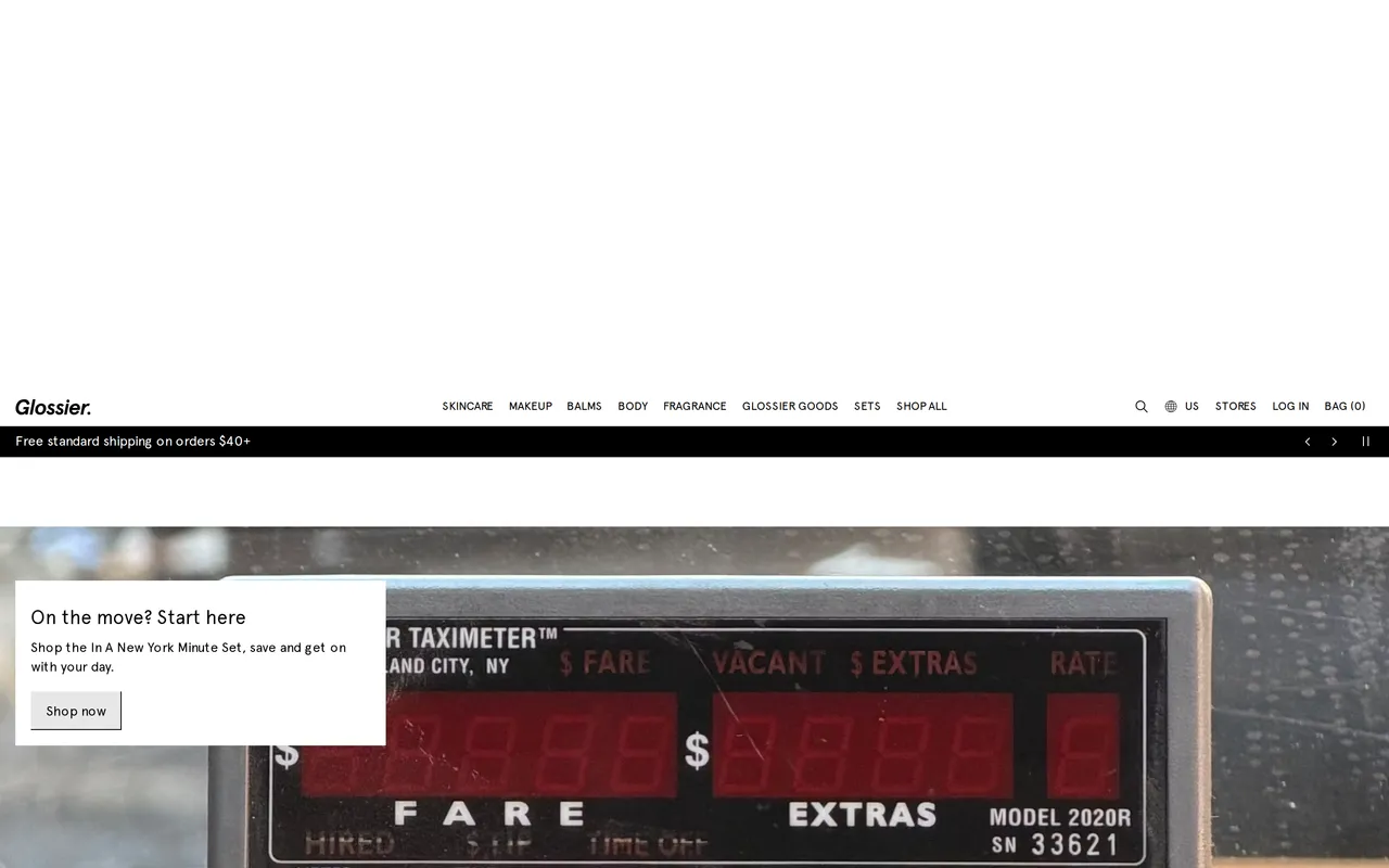
 glossier.comHomepage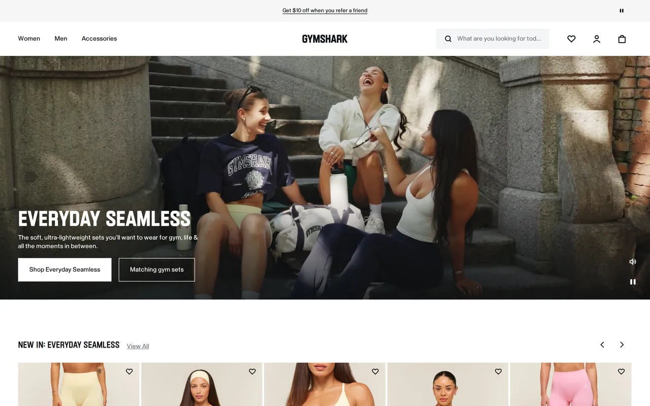
 gymshark.comHomepage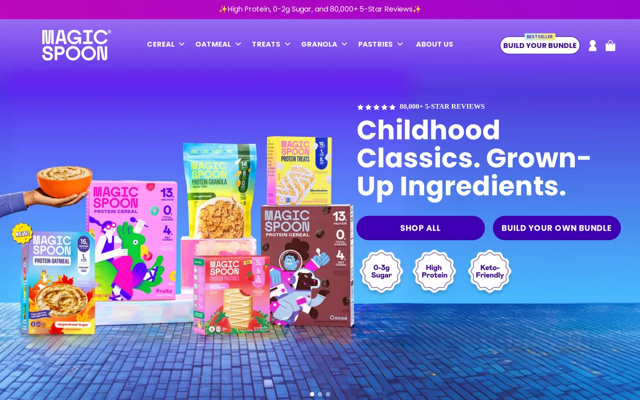
 magicspoon.comHomepage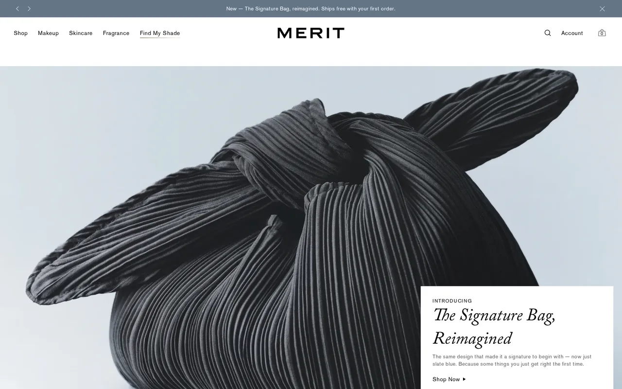
 meritbeauty.comHomepage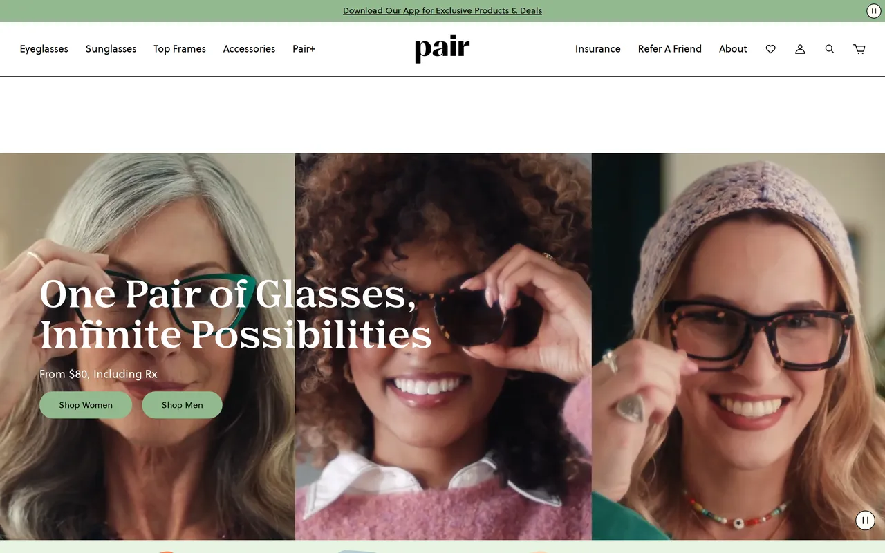
 paireyewear.comHomepage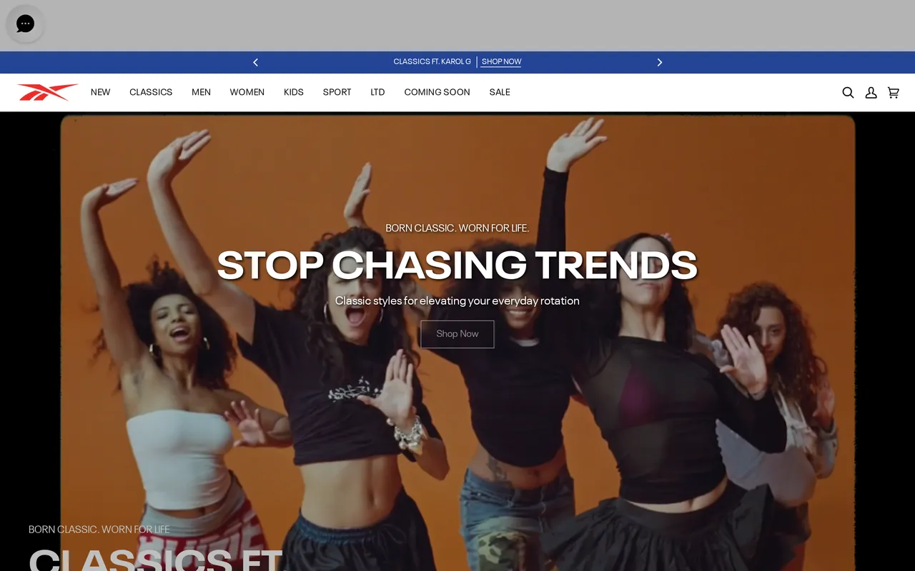
 reebok.comHomepage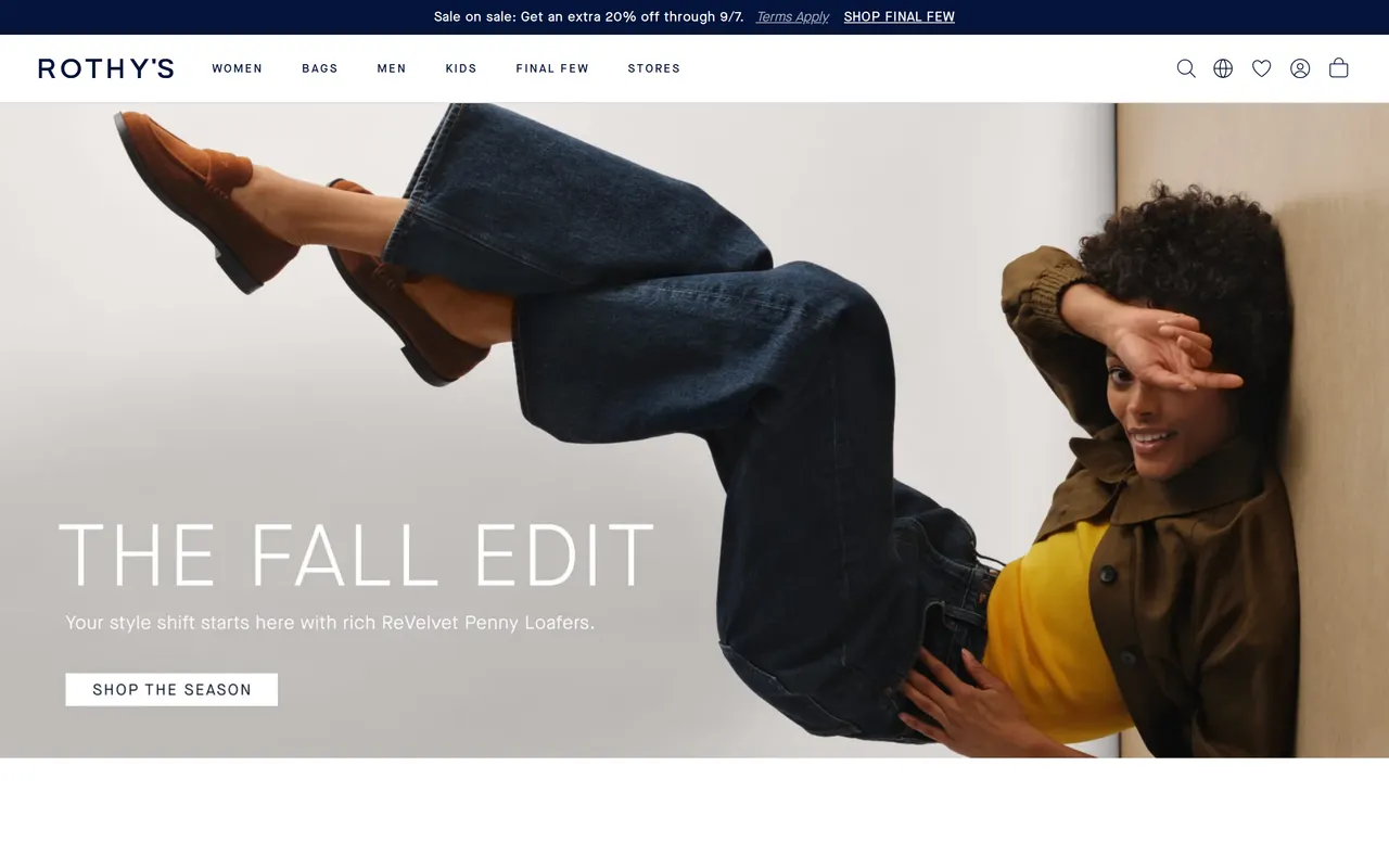
 rothys.comHomepage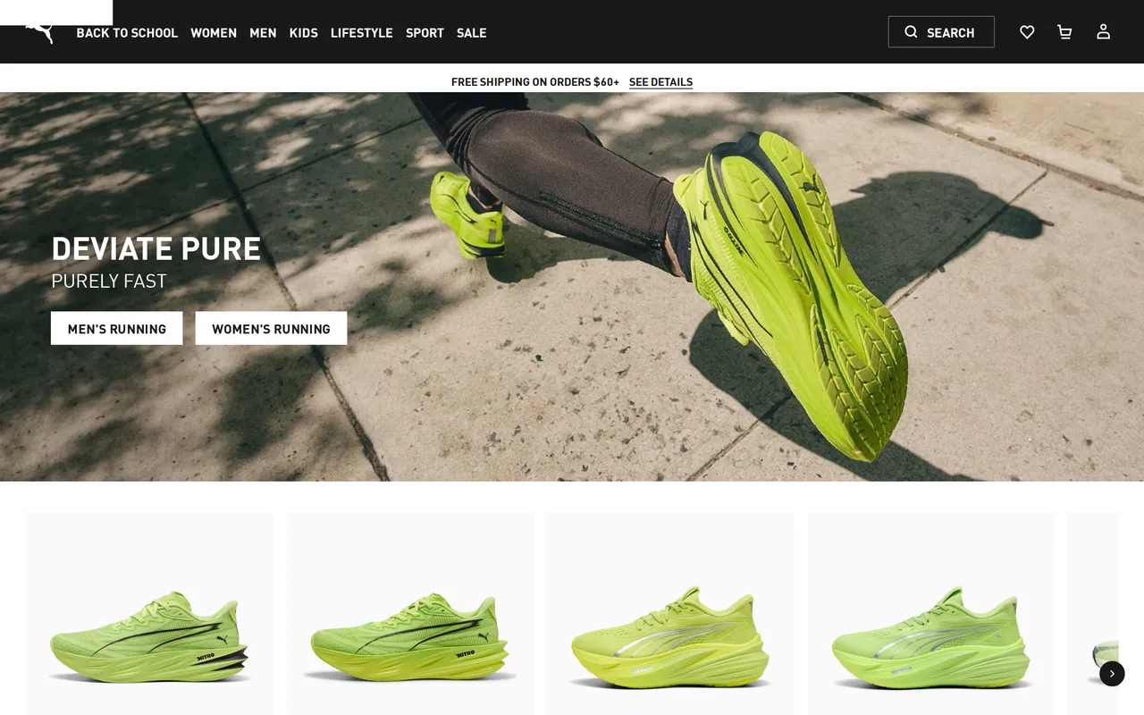
 us.puma.comHomepage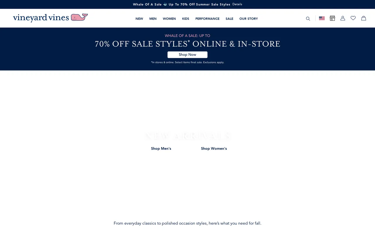
 vineyardvines.comHomepage
About the homepage pattern
What it is
A storefront homepage is the one page almost every visitor sees regardless of how they arrived, paid ad, organic search, a typed-in URL, or a returning customer's bookmark. Unlike a landing page built for one campaign, it has to serve all of those audiences at once: someone who has never heard of the brand, someone mid-consideration comparing it to a competitor, and someone who has already bought and is back for a reorder. That single-page, many-audience problem is what shapes almost every decision on it, from hero copy to how many collections get a tile above the fold.
Why it matters for conversion
The homepage sets the read on trust and price tier within the first couple of seconds, before a shopper has looked at a single product. A hero that answers "what do you sell and is it for me" quickly earns a scroll; one that opens with abstract brand language or a slow-loading video background loses a meaningful share of visitors before the fold even finishes rendering. Because so much paid and social traffic lands here first, small clarity gains at the top of the homepage compound into every downstream page's conversion rate, not just this one.
What to look for
Strong homepages front-load a clear value proposition in the hero, then use the first one or two scroll-stops to route different intents: a best-sellers or new-arrivals rail for browsers, a category grid for shoppers who already know what they want, and social proof (press logos, review counts, UGC) for skeptics still deciding whether to trust the brand at all. Navigation should make the full catalog reachable in one or two clicks, and the promo banner, if there is one, should say something concrete (a percentage, a deadline) rather than vague seasonal language.
Common variations
Fashion and lifestyle brands lean on full-bleed photography and looping video heroes to sell a feeling before a feature; DTC brands built on a single hero SKU often skip the category grid entirely and drive straight into that product's story. Marketplaces and multi-category retailers instead open with dense merchandising, several rows of curated collections, because their homepage has to double as a search-avoidance tool for shoppers who'd rather browse than type a query.
Brand palettes in this gallery
The exact colors these homepage screens are built from, sampled from each live storefront.
Related terms
See every homepage flow, state by state
The whole library is free to browse. Pro pipes these patterns straight into your AI tools over MCP.
Free to browse · Pro unlocks the MCP