Every state · 20 captures · 5 stores
Checkout patterns
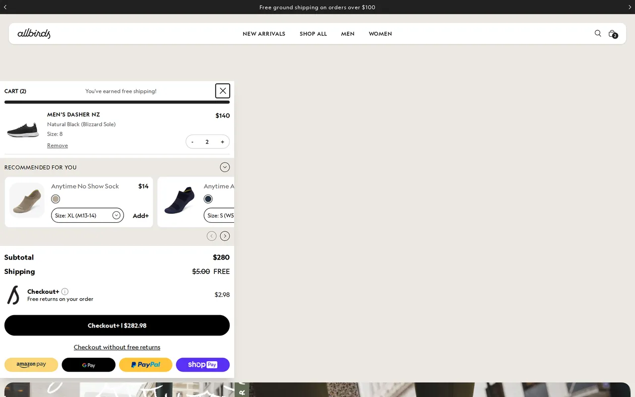
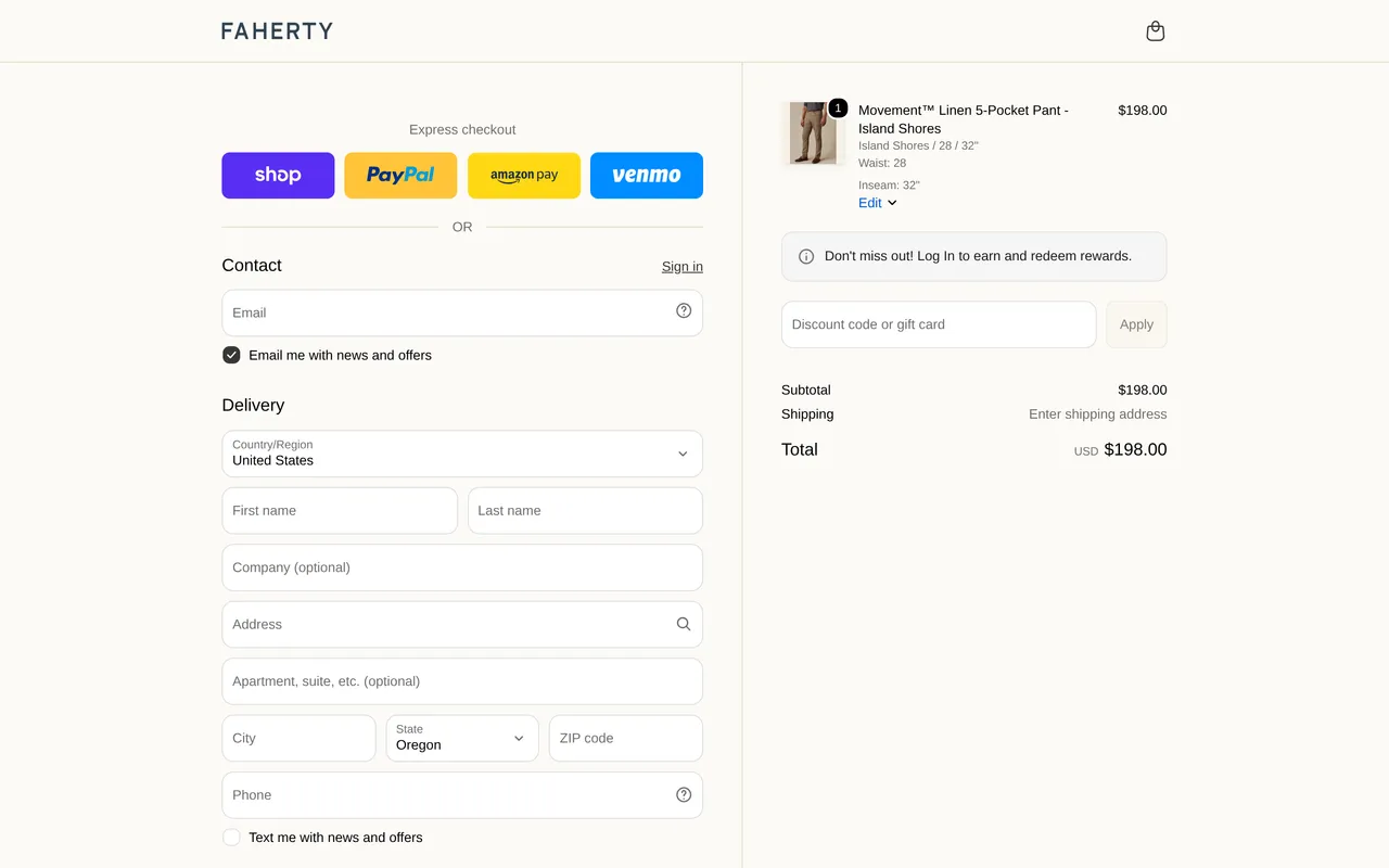
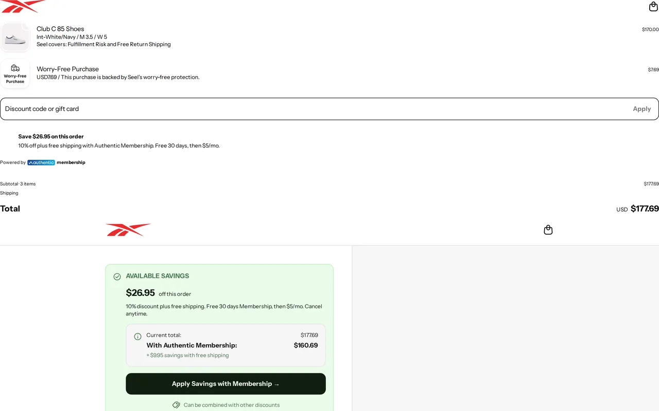
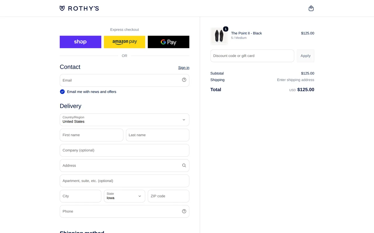
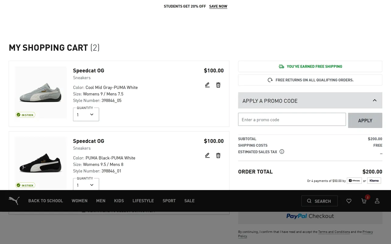
The checkout: contact, shipping, and payment screens where real stores fight to keep the shopper moving to purchase. Every example below is a real capture from a live storefront, not a mockup.





About the checkout pattern
What it is
Checkout is the sequence of screens, contact information, shipping address, delivery method, and payment, that turns a filled cart into a completed order. It's the most transactional part of the entire site: almost nothing here is about persuasion anymore, and almost everything is about removing friction for a shopper who has already decided to buy.
Why it matters for conversion
Checkout abandonment is one of the largest, most measurable leaks in e-commerce, and it's almost always caused by friction rather than a change of heart: an unexpected shipping cost revealed at the last step, a forced account creation, a form that doesn't validate an address until after submission. Every field removed and every distraction cut (like navigation that lets someone wander back to browsing mid-purchase) has a direct, well-documented effect on completed-order rate, which is why checkout tends to be the most heavily tested page on any serious e-commerce site.
What to look for
A well-built checkout shows shipping cost and estimated delivery date as early as possible, never after payment details are entered, and offers guest checkout as the default path rather than requiring an account. Autofill-friendly form fields, inline validation (catching a typo'd zip code before submit, not after), and a persistent order summary with the ability to edit the cart without losing checkout progress are the details that separate a fast checkout from one that generates support tickets.
Common variations
Many stores now compress checkout to a single scrolling page rather than the classic three-step wizard, since each additional step is a fresh chance to abandon. Higher-ticket and B2B-adjacent stores sometimes reintroduce multi-step checkout deliberately, using it to collect PO numbers or offer financing options that need their own screen. Subscription and replenishment businesses build checkout around a recurring-order summary, showing the next few ship dates and prices up front, rather than a one-time order total.
Brand palettes in this gallery
The exact colors these checkout screens are built from, sampled from each live storefront.
Related terms
See every checkout flow, state by state
The whole library is free to browse. Pro pipes these patterns straight into your AI tools over MCP.
Free to browse · Pro unlocks the MCP