Every state · 11 captures · 2 stores
Navigation / Mega Menu patterns
Navigation and mega menus: how real stores structure the catalog and open image-rich panels into departments and collections. Every example below is a real capture from a live storefront, not a mockup.
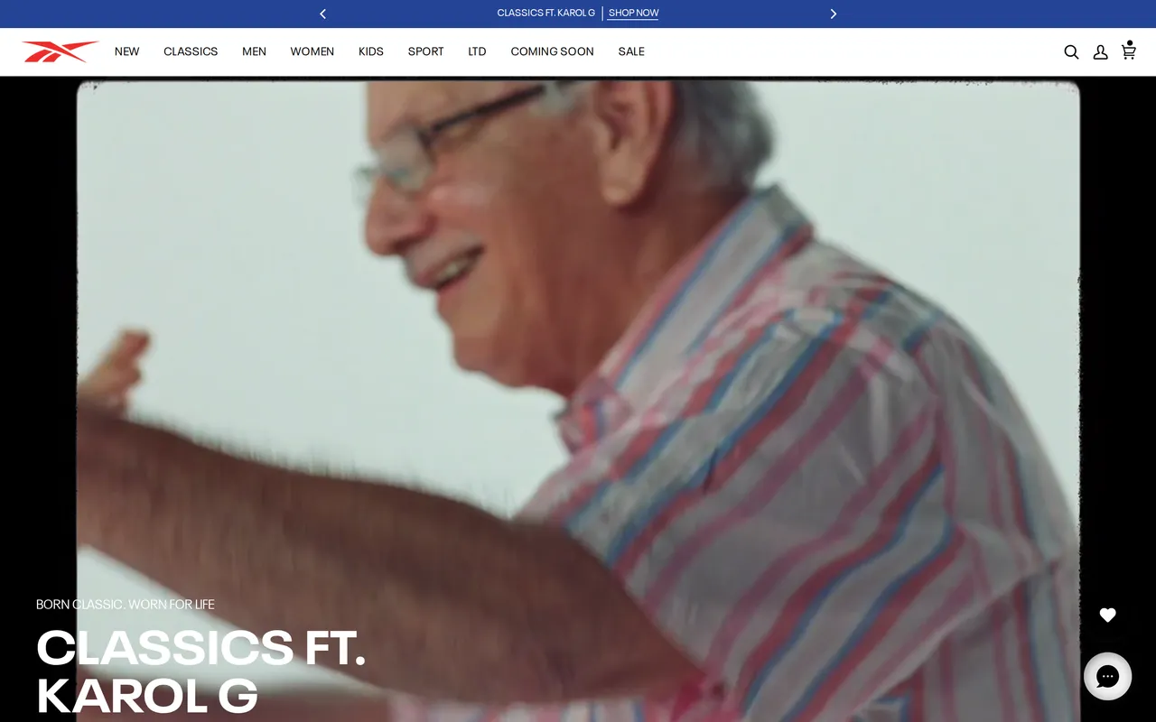

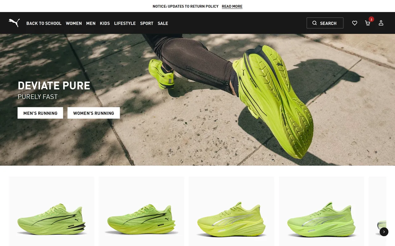

About the navigation / mega menu pattern
What it is
The navigation system is the top-of-page bar and the expanded mega-menu panels that open on hover or tap, laying out how the whole catalog is organized, departments, collections, featured edits, without ever loading a page. It's the one piece of UI present on every screen, and the store's clearest single statement of what it actually sells and how it wants shoppers to think about the assortment.
Why it matters for conversion
Most browse-intent shoppers reach a product through navigation rather than search, so the taxonomy here decides whether someone lands on the right listing in one or two confident moves or gives up hunting. A clear nav quietly does merchandising work too, the collections a brand chooses to surface in a mega-panel are the ones that get seen, while a cluttered or mislabeled menu leaks traffic before a single product page is ever reached.
What to look for
Strong navigation groups the catalog the way shoppers actually think (by category, use-case, or occasion, not internal org charts), keeps depth shallow enough that nothing important is more than two clicks away, and uses the mega-panel's real estate for featured imagery and curated edits rather than an undifferentiated link dump. On desktop it should open on hover without twitchy accidental closes; on mobile it should collapse into a drawer that preserves the same hierarchy rather than flattening it.
Common variations
Multi-category and fashion retailers lean on image-rich mega-panels with featured collections and campaign tiles, since discovery is half the value of their nav. Single-line DTC brands with a tight catalog often skip the mega-menu entirely for a simple horizontal bar, because the extra structure would be theater. Marketplaces and big-box sites invest in a dense, department-first tree paired with a prominent persistent search, betting that their catalogs are too large to navigate by browsing alone.
See every navigation / mega menu flow, state by state
The whole library is free to browse. Pro pipes these patterns straight into your AI tools over MCP.
Free to browse · Pro unlocks the MCP